Alora Safari Logo

Alora Safari Couture Designs

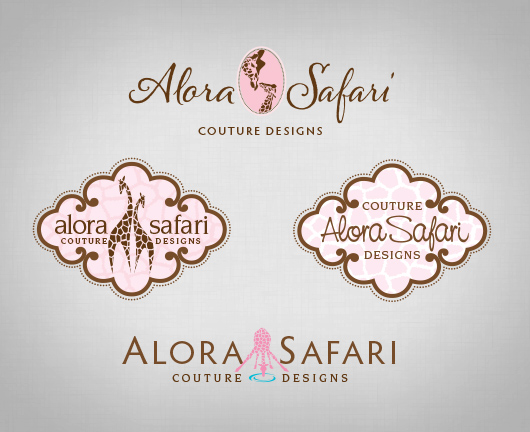
I created this logo for a dear friend’s etsy shop. She creates amazing tutu dresses and accessories for special occasions. The giraffes are a nod to her former shop name, The Pink Giraffe, which she was forced to change because of a trademark issue. She chose a new name, Alora (dream) Safari (journey), which refers to her dream to grow her family through adoption, hence the nurturing image of a mother and baby giraffe. The dots instead of a more realistic giraffe pattern adds an element of fun.

Here are some other logo concepts that were developed in the design process:

Alora Safari

More of my logo designs can be viewed here.

Logo Development – Crooked Tree Cards

CTC_PaintedWood


I started Crooked Tree Cards, an online store for personalized photo greeting cards, out of a strong belief that relationships are priceless.

My life both as a child and adult has involved frequent moves. However, the one place that our family continues to come back to is a small inland lake in Northern Michigan. As one drives the winding road back to our cabin, everyone in the car tries to be the first to spy the crooked tree! Time spent at the cabin always means sharing time with our extended family and friends.

We discovered that the relationships we have nurtured along the way are priceless! And sometimes FaceBook isn’t enough to stay connected.

I’ve always loved photos and finding the stories in them, but our family pictures always ended up stored in boxes. As a graphic designer, digital scrapbooks were a natural solution to share some special photos. It wasn’t long before I was creating photo collages to share our family’s pictures in our annual Christmas letter. Soon after that I began Crooked Tree Cards.

My goal is to help people stay connected to those priceless relationships in their lives through beautifully crafted photo greeting cards.

CTC_InitialConcepts_logos

My initial logo concepts fell short capturing my vision for the online storefront. At first, it seems logical to start with an illustration of the “Crooked Tree” as I remember it from my childhood since that’s where the name comes from. But it was such an odd looking tree, it didn’t seem to matter whether I illustrated it realistically or abstractly, it would be difficult for anyone who wasn’t familiar with the strange tree to connect with it. So, the logical solution was to try a logotype, but I wasn’t satisfied with those results either.

One of the hardest things I’ve had to do as a graphic designer is to design anything for myself. I realized in the middle of this project that the reason I was struggling so much was because I had failed to work the process I do with my clients to get at the heart of what their organization is all about and communicate that in the logo. So I went back to the drawing board and came up with this:

CTC_logo

The core value of the business and the reason sending cards is important is because “relationships are priceless.” In illustrating the tree for the logo, I bent the trunk to suggest a heart. The branches reach out toward others with heart-shaped fruit. The font is friendly with little loops in some of the letters reaching out toward the next one.

You can view more of my logo/identity work here.

Update or Redesign a Logo?

CCM_logo

Sometimes a logo update is a better option for an organization then a complete redesign. If a company has a lot invested in a symbol that is highly recognized by its target market, it can prove more effective to follow the example of Pepsi, Burger King, KFC and Taco Bell and tweak the design rather than to start from scratch. That’s what Christian Care Ministry decided when they asked me to give their family of logos a fresh look.

CCM_Before-After_logos

CCM’s original logo incorporated a Christian cross within a medical cross. They wanted to move away from a medical cross that is strongly identified with Red Cross. They also wanted a way to reflect their four main programs in the corporate logo. We kept the angled Christian cross but softened it with a curve and rounded edges. The colored sections hint at a stained glass window, a nod to their target audience of church members. Each section represents one of their four main programs: Medi-Share, Manna, Restore and Healthy Church.

CCM_Program_logos


Now the family of logos looks connected, clean and strong. The logos are primarily used in pieces that are printed in full color or viewed on the web, so using color to distinguish the programs instead of different symbols was a viable option for CCM.

Is your logo a bit outdated, perhaps with a font that was popular in the 90s? Does it incorporate elements like a swash or globe that dates it around the turn of the century? It might be time to revisit your logo design. I would love to discuss with you whether an update or complete redesign of your logo would best serve your organization. Simply fill out the the contact form and tell me a little about it.

You can view more of my logo designs here.