I started Crooked Tree Cards, an online store for personalized photo greeting cards, out of a strong belief that relationships are priceless.
My life both as a child and adult has involved frequent moves. However, the one place that our family continues to come back to is a small inland lake in Northern Michigan. As one drives the winding road back to our cabin, everyone in the car tries to be the first to spy the crooked tree! Time spent at the cabin always means sharing time with our extended family and friends.
We discovered that the relationships we have nurtured along the way are priceless! And sometimes FaceBook isn’t enough to stay connected.
I’ve always loved photos and finding the stories in them, but our family pictures always ended up stored in boxes. As a graphic designer, digital scrapbooks were a natural solution to share some special photos. It wasn’t long before I was creating photo collages to share our family’s pictures in our annual Christmas letter. Soon after that I began Crooked Tree Cards.
My goal is to help people stay connected to those priceless relationships in their lives through beautifully crafted photo greeting cards.
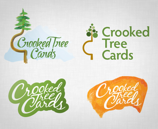
My initial logo concepts fell short capturing my vision for the online storefront. At first, it seems logical to start with an illustration of the “Crooked Tree” as I remember it from my childhood since that’s where the name comes from. But it was such an odd looking tree, it didn’t seem to matter whether I illustrated it realistically or abstractly, it would be difficult for anyone who wasn’t familiar with the strange tree to connect with it. So, the logical solution was to try a logotype, but I wasn’t satisfied with those results either.
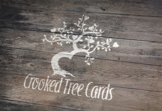
One of the hardest things I’ve had to do as a graphic designer is to design anything for myself. I realized in the middle of this project that the reason I was struggling so much was because I had failed to work the process I do with my clients to get at the heart of what their organization is all about and communicate that in the logo. So I went back to the drawing board and came up with this:
![]()
The core value of the business and the reason sending cards is important is because “relationships are priceless.” In illustrating the tree for the logo, I bent the trunk to suggest a heart. The branches reach out toward others with heart-shaped fruit. The font is friendly with little loops in some of the letters reaching out toward the next one.
You can view more of my logo/identity work here.
[…] Stop by Crooked Tree Cards and browse the collection of fully customizable designs today. Read about the logo development for the online store here. […]