One of the challenges organizations face is creating a unified vision of their brand strategy across its many expressions: brochures, newsletter, stationery, direct mail appeals, web site, signage and trade show graphics. This can be accomplished in different ways, but some of the tools designers can employ are a consistent fonts and color palette, a repeated shape (as a graphic element or even shape of the finished piece) or other graphic elements like a page border, ghosted image or background texture.
For World Hope International, we chose a consistent color palette, fonts, color blocks, bright colorful photos of people and similarly styled icons to tie together their general brochure, program brochures and newsletter with annual report.
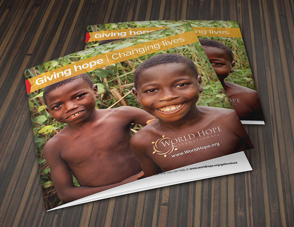
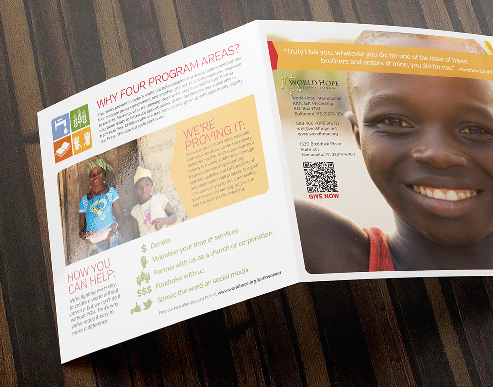
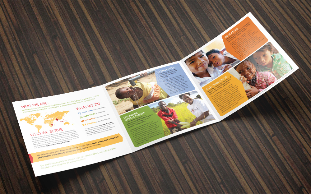
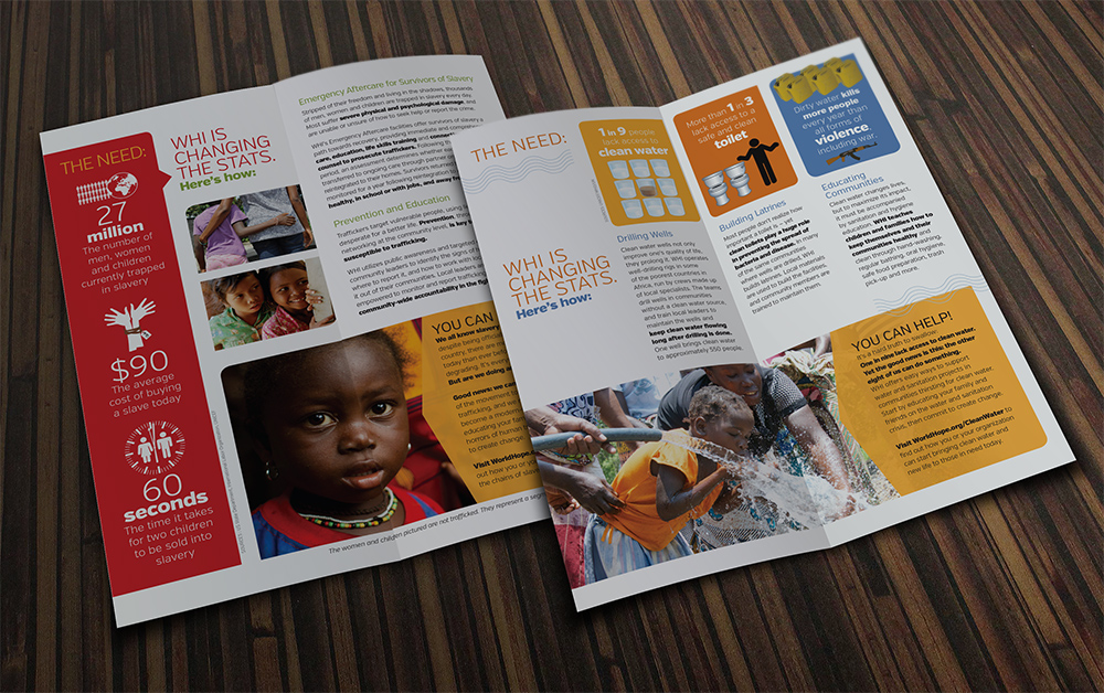
General Brochure
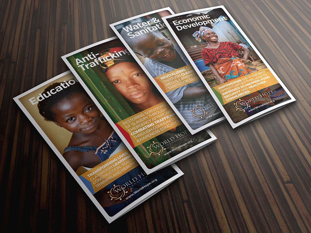
Program Brochures
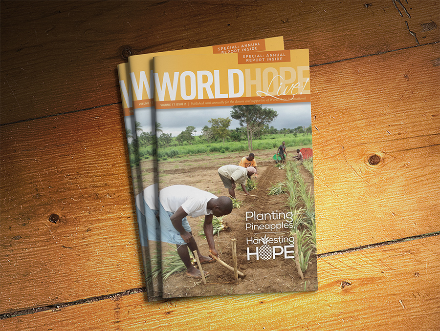
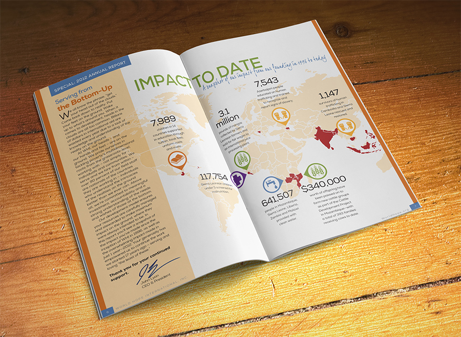
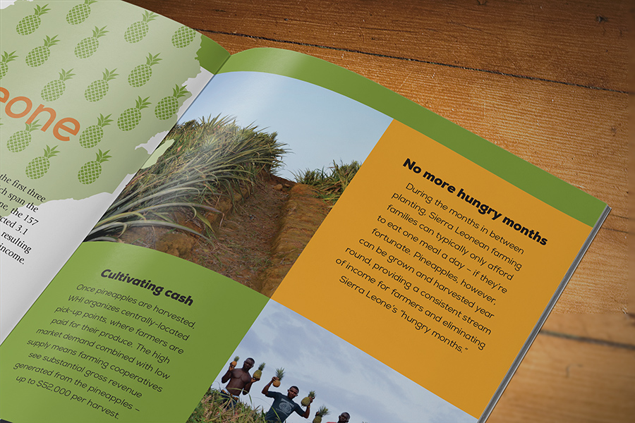
Newsletter with Annual Report
To view more brochure designs, click here.
Leave a Reply