![]()
Sometimes a logo update is a better option for an organization then a complete redesign. If a company has a lot invested in a symbol that is highly recognized by its target market, it can prove more effective to follow the example of Pepsi, Burger King, KFC and Taco Bell and tweak the design rather than to start from scratch. That’s what Christian Care Ministry decided when they asked me to give their family of logos a fresh look.
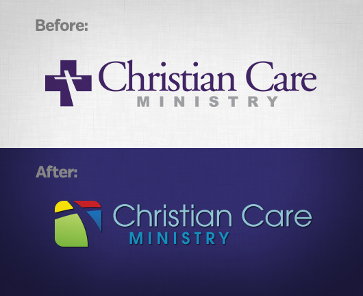
CCM’s original logo incorporated a Christian cross within a medical cross. They wanted to move away from a medical cross that is strongly identified with Red Cross. They also wanted a way to reflect their four main programs in the corporate logo. We kept the angled Christian cross but softened it with a curve and rounded edges. The colored sections hint at a stained glass window, a nod to their target audience of church members. Each section represents one of their four main programs: Medi-Share, Manna, Restore and Healthy Church.
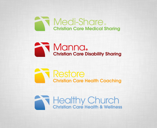
Now the family of logos looks connected, clean and strong. The logos are primarily used in pieces that are printed in full color or viewed on the web, so using color to distinguish the programs instead of different symbols was a viable option for CCM.
Is your logo a bit outdated, perhaps with a font that was popular in the 90s? Does it incorporate elements like a swash or globe that dates it around the turn of the century? It might be time to revisit your logo design. I would love to discuss with you whether an update or complete redesign of your logo would best serve your organization. Simply fill out the the contact form and tell me a little about it.
You can view more of my logo designs here.