Cut Mailing Costs in Half

Helping One Another Newsletter - for Christian Care Ministry

Christian Care Ministry / Medi-Share is a health sharing organization, connecting Christians who want to live out the biblical mandate to carry one another’s burdens by sharing in each other’s medical expenses. Besides sharing medical bills, members encourage and pray for one another. They are supported by an organization that provides health education and promotes biblical living. Since 1993 more than $775 million in healthcare costs have been shared or discounted.

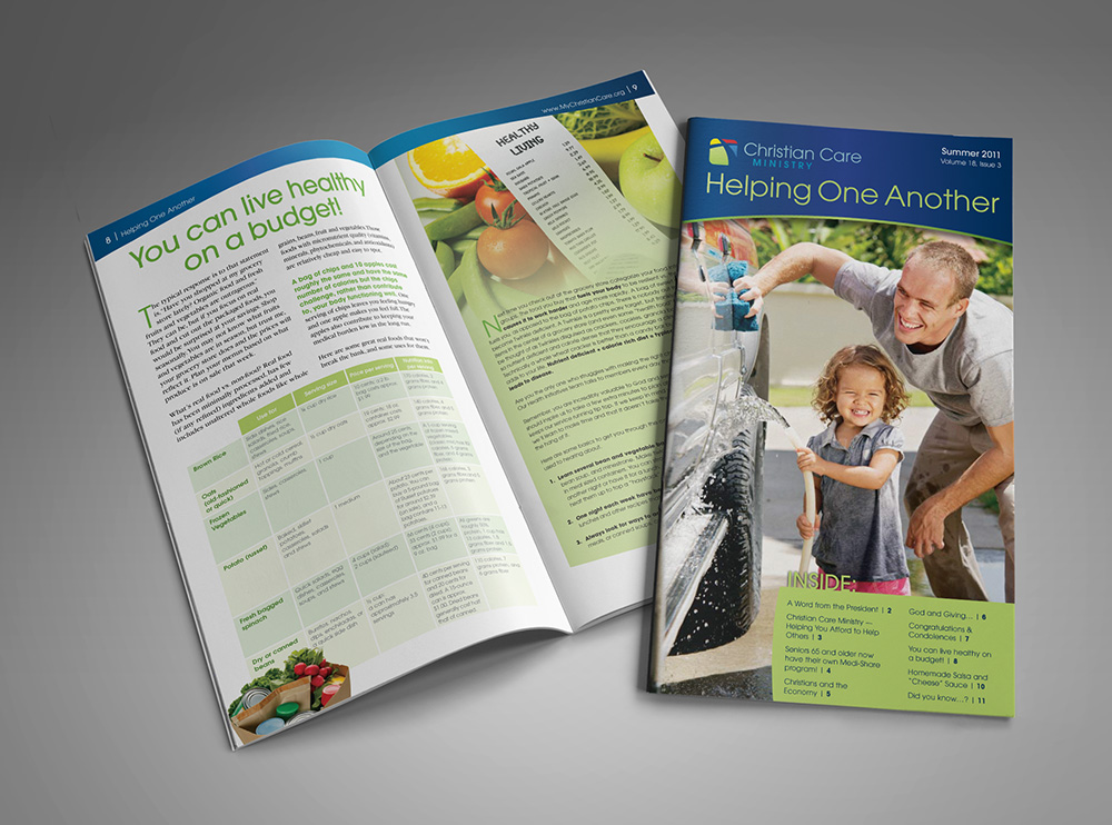
As part of the educational mission of Christian Care Ministry, they produce a quarterly newsletter filled with encouragement, tips for healthy living, testimonies and ministry information. When I started designing their newsletter it was a 2-color, 8-page, 8.5″ x 11″ document. After a few issues I suggested a redesign with a 4-color, 12-page, oblong 6″ x 11″ booklet. Color printing has become extremely affordable in recent years, helping to keep the print production costs roughly the same as what they had been for 2-color, even with adding 4 pages.

When mailing bulk pieces, the U.S. Postal Service uses seven classifications to determine the postal rate: letters (machinable and non-machineable), flats (machinable and non-machineable), postcards, machinable parcels, irregular parcels, marketing parcels and outside parcels. Don’t let the names fool you, the classifications are determined by size and shape more than content; for example, a postcard is classified as a letter if it is a rectangle and larger than 4.25″ x 6″ or a flat if it is square instead of rectangle. A postcard is the most economical rate, then letter, then flat.

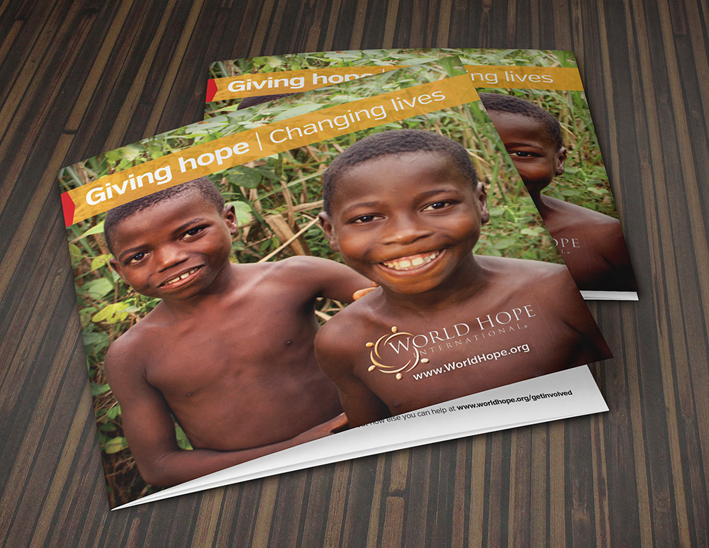
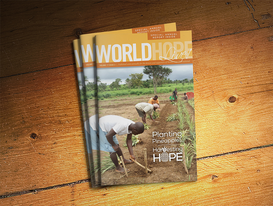
By redesigning the newsletter to a 6″ x 11″ booklet instead of an 8.5″ x 11″ booklet, the ministry saved almost 50% in the cost of mailing their newsletter. I redesigned World Hope International’s newsletter to this money-saving format as well.

WHI Newsletter/Annual Report

To see other examples of my publication design, click here.


Creating a Unified Look to Support Brand Strategy

WHI_Gen_Covers

One of the challenges organizations face is creating a unified vision of their brand strategy across its many expressions: brochures, newsletter, stationery, direct mail appeals, web site, signage and trade show graphics. This can be accomplished in different ways, but some of the tools designers can employ are a consistent fonts and color palette, a repeated shape (as a graphic element or even shape of the finished piece) or other graphic elements like a page border, ghosted image or background texture.

For World Hope International, we chose a consistent color palette, fonts, color blocks, bright colorful photos of people and similarly styled icons to tie together their general brochure, program brochures and newsletter with annual report.

General Brochure

WHI_Gen_CloseUp

WHI_Gen_Inside

Program Brochures

WHI_ProgramBroch

OLYMPUS DIGITAL CAMERA

Newsletter with Annual Report

WHI_NL-AR13_Covers

WHI_NL-AR13

WHI_NL-AR13_Closeup2

To view more brochure designs, click here.


Camp Barakel Retreats & Camps

Broch_Barakel_SummerCampsB

Camp Barakel is nestled in a beautiful forest on the sunrise side of Michigan. Their 350 acres include a gorgeous spring fed lake. They operate dual camps, one on either side of Shear Lake. It is one of the most charming camps I’ve ever seen, with an old log block house, quaint log chapel (complete with an old moose head above a massive stone fireplace) and gorgeous lodge-style ministry center.

I have been privileged to partner with them to create promotional materials that reflect their mission and values. This is especially meaningful to me because we own a cabin just a few miles from the camp, and Camp Barakel is part of the culture in that area “up north,” as we Michiganders like to say. I remember attending Sunday worship services with the campers in the rustic chapel while vacationing at the cabin when I was a little girl.

Broch_Barakel_WinterRetreat


Camp volunteer photographers capture amazing images of all the fun activities for children, teens and families. We us the photos more than words to tell the story of camp, but the quality photos aren’t the only design elements to do so. The display fonts are both rugged and fun to reflect the outdoor adventure and  handwriting fonts highlight information with a warm, friendly flair.

Even the paper selection contributes to the story: we print most pieces on uncoated stock for an “earthy” look and feel. Most camps catering to youth are printed on glossy stock for eye-popping color and a slick feel, but we made a strategic decision to represent Camp Barakel in a “back to nature” way.

Camp Barakel Fall Retreats Mailing