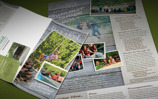
Camp Barakel is nestled in a beautiful forest on the sunrise side of Michigan. Their 350 acres include a gorgeous spring fed lake. They operate dual camps, one on either side of Shear Lake. It is one of the most charming camps I’ve ever seen, with an old log block house, quaint log chapel (complete with an old moose head above a massive stone fireplace) and gorgeous lodge-style ministry center.
I have been privileged to partner with them to create promotional materials that reflect their mission and values. This is especially meaningful to me because we own a cabin just a few miles from the camp, and Camp Barakel is part of the culture in that area “up north,” as we Michiganders like to say. I remember attending Sunday worship services with the campers in the rustic chapel while vacationing at the cabin when I was a little girl.
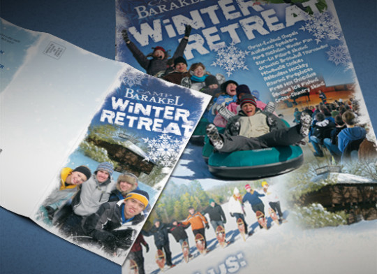
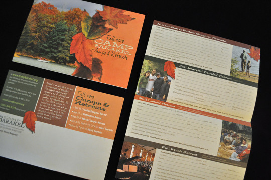
Camp volunteer photographers capture amazing images of all the fun activities for children, teens and families. We us the photos more than words to tell the story of camp, but the quality photos aren’t the only design elements to do so. The display fonts are both rugged and fun to reflect the outdoor adventure and handwriting fonts highlight information with a warm, friendly flair.
Even the paper selection contributes to the story: we print most pieces on uncoated stock for an “earthy” look and feel. Most camps catering to youth are printed on glossy stock for eye-popping color and a slick feel, but we made a strategic decision to represent Camp Barakel in a “back to nature” way.
