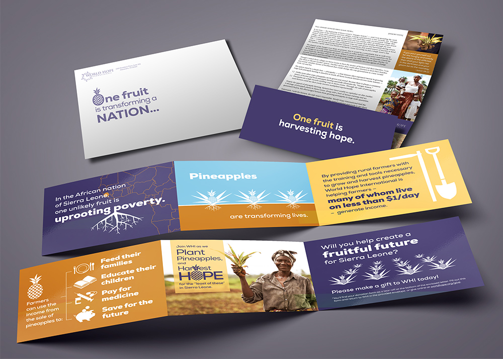
Direct mail appeals are the lifeline for nonprofit organizations to connect with and invite donors to partner with them in their ministries. I’ve often said designs that reach the heart have sticking power in the mind. Once in the mind, donors can make a decision about how to respond. Above is a recent appeal from World Hope International.
Three Key Things to Remember about Appeals
- An appeal isn’t really about you. It’s about the difference your donors can make when they partner with you. Donors want to be a part of making a difference in the world and you are simply the conduit. Be sure to focus on them and the outcome when they partner with you.
- Tell a story. The language of the heart is stories, so reach donors’ hearts by telling great stories. Remember number 1 above: be sure to connect them to the story by telling the difference they make in the story. One effective way to tell stories is to use quality photos. Another popular trend right now for nonprofits is to tell the story through statistics showing the need or proving the effectiveness of their methods. Just remember the goal is to get them to participate in what you are doing and people make that decision with their heart first, so make the stats relatable.
- Make a clear “ask.” For the most effective appeal, be specific about how people can respond, the difference they can make if they respond and an easy way to give/signup to volunteer/spread the word (or whatever action you need from them.) Keep the ask simple with one need and one type of response. Ministry needs are great, but be careful not to stuff your appeal with requests — it waters down the impact of the appeal and invites indecision.
In the “Chen’s Story” appeal raising money for World Hope International’s anti-trafficking efforts, we weren’t able to use photographs of Chen or girls like her at the Assessment Center because of the need to protect the women and children from further exploitation, so we used artwork from some art therapy sessions that the girls had participated in while at the Assessment Center. The result was perhaps even more effective than if we had used photos because the artwork expressed their hearts and therefore gripped the hearts of donors.
To view other appeal designs, click here.


Leave a Reply